 FAO Map Catalog
poverty
Type of resources
Available actions
Topics
Keywords
Contact for the resource
Provided by
Years
Formats
Representation types
Update frequencies
status
Scale
Resolution
-

This data set depicts the distribution of marginal areas by administrative zones in Santiago, Cape Verde, according to a Marginality Index methodology. The Marginality Index measures the incidence of food insecurity and poverty (FIP) among the households living in each area. The index is created as a function of the most relevant variables of the year 2000 Demographic Census, using the principal components methodology. Areas with an index score above a selected threshold level have been classified as vulnerable. The boundaries of administrative zones were digitized from scanned and rectified topographic maps (Carta Militar de Portugal, Ilha de Santiago 1969).
-
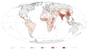
Chronic child malnutrition (stunting among children under 5 years of age) represents a good proxy of rural poverty and food insecurity (FAO 2008 and FAO 2003) and, by overlaying stunting rate and population density, this map aims at showing poor population distribution (person/sq km) in developing countries.
-
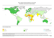
The FGGD extreme poverty map is a global vector datalayer at scale 1:5 000 000. The map depicts the differences among countries with respect to the national population estimated to be living in extreme poverty as of the latest year for which data was available in 2005. Data have been compiled by FAO from data reported in World Bank, WDI Online, as of April 2005.
-
The FGGD poverty map is a global vector datalayer at scale 1:5 000 000. The map depicts the differences among countries with respect to the national population estimated to be living in poverty as of the latest year for which data was available in 2005. Data have been compiled by FAO from data reported in World Bank, WDI Online, as of April 2005.
-
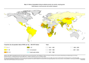
This map is adapted from a global GIS database maintained by FAO on food insecurity, poverty and environment global GIS database (FGGD). It is based on stunting data among children under 5 years of age, around year 2000. Stunting among children is used by FAO as an indicator of food insecurity and, indirectly, of poverty.
-
The FGGD degree of human development map is a global vector datalayer at scale 1:5 000 000. The map depicts national statistical data and highlights differences among countries with respect to the human development index for the year 2000. Data are from UNDP, 2002, Human Development Report.
-
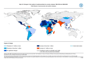
The FGGD changes in undernourishment map is a global vector datalayer at scale 1:5 000 000. The map depicts the differences among countries with respect to the difference between the share of the population estimated to be undernourished in 1990-1992 and in 2000-2002, as reported in the FAO publication The State of Food Insecurity (SOFI) in the World 2004. The method used by FAO to estimate the number of undernourished by country is described in FAOSTAT.
-
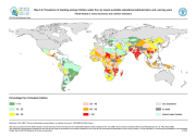
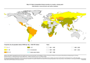
The FGGD prevalence of stunting map is a global raster datalayer with a resolution of 5 arc-minutes. The percentage of stunted children undev five year old is reported according to the lowest available sub-national administrative units: all pixels within the unit boundaries will have the same value. Data have been compiled by FAO from different sources: Demographic and Health Surveys (DHS), UNICEF MICS, WHO Global Database on Child Growth and Malnutrition, and national surveys.
-
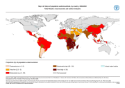
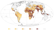
The FGGD prevalence of undernourishment map is a global vector datalayer at scale 1:5 000 000. The map depicts the differences among countries with respect to the share of the national population estimated to be undernourished in 2000-2002, as reported in the FAO publication The State of Food Insecurity (SOFI) in the World 2004. The method used by FAO to estimate the number of undernourished by country is described in FAOSTAT.
-

The “richness index” represents the level of economical wellbeing a country certain area in 2010. Regions with higher income per capita and low poverty rate and more access to market are wealthier and are therefore better able to prepare for and respond to adversity. The index results from the second cluster of the Principal Component Analysis preformed among 9 potential variables. The analysis identifies four dominant variables, namely “GDPppp per capita”, “agriculture share GDP per agriculture sector worker”, “poverty rate” and “market accessibility”, assigning weights of 0.33, 0.26, 0.25 and 0.16, respectively. Before to perform the analysis all variables were log transformed (except the “agriculture share GDP per agriculture sector worker”) to shorten the extreme variation and then were score-standardized (converted to distribution with average of 0 and standard deviation of 1; inverse method was applied for the “poverty rate” and “market accessibility”) in order to be comparable. The 0.5 arc-minute grid total GDPppp is based on the night time light satellite imagery of NOAA (see Ghosh, T., Powell, R., Elvidge, C. D., Baugh, K. E., Sutton, P. C., & Anderson, S. (2010).Shedding light on the global distribution of economic activity. The Open Geography Journal (3), 148-161) and adjusted to national total as recorded by International Monetary Fund for 2010. The “GDPppp per capita” was calculated dividing the total GDPppp by the population in each pixel. Further, a focal statistic ran to determine mean values within 10 km. This had a smoothing effect and represents some of the extended influence of intense economic activity for the local people. Country based data for “agriculture share GDP per agriculture sector worker” were calculated from GDPppp (data from International Monetary Fund) fraction from agriculture activity (measured by World Bank) divided by the number of worker in the agriculture sector (data from World Bank). The tabular data represents the average of the period 2008-2012 and were linked by country unit to the national boundaries shapefile (FAO/GAUL) and then converted into raster format (resolution 0.5 arc-minute). The first administrative level data for the “poverty rate” were estimated by NOAA for 2003 using nighttime lights satellite imagery. Tabular data were linked by first administrative unit to the first administrative boundaries shapefile (FAO/GAUL) and then converted into raster format (resolution 0.5 arc-minute). The 0.5 arc-minute grid “market accessibility” measures the travel distance in minutes to large cities (with population greater than 50,000 people). This dataset was developed by the European Commission and the World Bank to represent access to markets, schools, hospitals, etc.. The dataset capture the connectivity and the concentration of economic activity (in 2000). Markets may be important for a variety of reasons, including their abilities to spread risk and increase incomes. Markets are a means of linking people both spatially and over time. That is, they allow shocks (and risks) to be spread over wider areas. In particular, markets should make households less vulnerable to (localized) covariate shocks. This dataset has been produced in the framework of the “Climate change predictions in Sub-Saharan Africa: impacts and adaptations (ClimAfrica)” project, Work Package 4 (WP4). More information on ClimAfrica project is provided in the Supplemental Information section of this metadata.